Citymapper — Offline Maps Feature
Public transport navigation app used daily by commuters across Europe.
Task: identify three missing features and design one as a hi-fi prototype.
Role: UX Researcher and UI Designer | Team of 4 | 2 weeks
Week 1: team research and lo-fi | Week 2: hi-fi and testing
Tools: Figma, FigJam, Lyssna, Google Forms, Photoshop, Slack


Citymapper has no offline mode. Users lose all navigation the moment they lose signal — underground, abroad, in low-coverage areas. This is the app's most cited weakness.
Survey (14 respondents) confirmed: offline access ranked as a top-3 most important feature (57%). Missing real-time updates and inaccurate routes were the top reported problems — both worsened without connectivity.
Three features were proposed: offline maps, nearby places search, live location sharing. The class voted for offline maps.
Note: I personally reached out to Citymapper — via their feedback form and through LinkedIn — to get business context for the project. No response was received.
Lo-fi sketches mapped the core flow: main screen → settings → pick city → download confirmation → success. Three mid-fi iterations were tested before moving to hi-fi.
Key finding from mid-fi testing: users couldn't find the feature. They searched under Maps, Places, and Switch City — not Settings. The entry point was wrong.
Hi-fi was built with Citymapper's visual language: green palette, existing UI components, Citymapper tone of voice.


Download Map moved to the top of App Settings — visible immediately on entry. Pick City screen with search and city list. Download confirmation modal. Progress indicator. Success screen.
After usability testing (Slack video calls): entry point clarified, downloaded maps made more visible, quick access added.
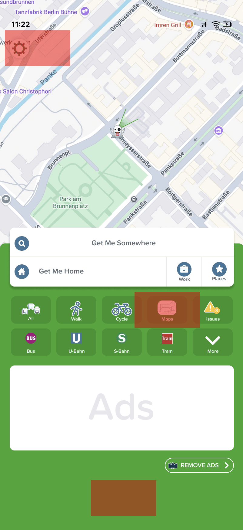


The biggest insight came from testing, not research: users had a mental model mismatch. They expected offline maps to live under their city, not inside Settings. This is a common pattern in navigation apps — users organise information geographically, not by app architecture. Moving one element fixed the core usability problem, but it also revealed something broader: the feature discovery problem wasn't about labelling, it was about where users look first.
Three mid-fi iterations were needed before the entry point felt right. Each round of testing on Slack video calls added one specific fix — not a redesign, just a single informed adjustment. That's the process working as it should.
"Stressful" appeared in the 5-second moodboard test alongside "Modern" and "Urban" — a signal that the visual direction leaned too heavily into urban chaos rather than reliability. For a navigation app whose core promise is getting you home safely without internet, "stressful" is the wrong emotional register. A next iteration would recalibrate the visual tone toward calm confidence without losing the urban energy that makes Citymapper feel alive.
Reaching out directly to Citymapper — through their feedback form and via LinkedIn — was an attempt to get real business context for the project. No response came, which is itself a data point: large product teams rarely engage with unsolicited design proposals. In a real studio context, this kind of stakeholder access would be the first thing to establish before any design work begins.
Next step: an unmoderated usability test — users find the feature starting from the home screen, with no instruction. That's the only way to know if the entry point fix actually holds.