Kindly — Community Help App
Community help app connecting neighbours — people who need assistance with daily tasks and people willing to provide it. Designed for anyone temporarily limited: after surgery, injury, childbirth, or burnout.
Role: UX Researcher (team), Verification flow (lo-fi → mid-fi → hi-fi) and core product concept | Team of 3 | 2 weeks
Week 1: individual ideation and team UX | Week 2: team hi-fi
Tools: Figma, FigJam, Lyssna, Google Forms, Photoshop, Slack


87.5% of survey respondents had experienced a period when daily tasks became physically or emotionally overwhelming. Most managed either alone or by asking friends and family — professional services were used by only 6.5%.
The core barrier wasn't logistics — it was psychological. 80% named the psychological barrier of asking for help as their biggest challenge during difficult periods. An app needed to make asking feel safe and normal, not shameful.
What was the biggest challenge for you during that period?
(The psychological barrier (feeling guilty or awkward about asking for help - 80%).

Have you ever experienced a period (even a short one) when daily chores became physically or emotionally overwhelming? (87,5% - Yes)
What kind of recognition would make you feel good about helping? (81,3% - A simple "thank you" and knowing I was useful)
Trust was the second critical issue: 67.7% said ID verification would make them trust a stranger, 61.3% — mutual connections or verified address.

Week 1: each team member developed an independent concept. My proposal focused on dual-role users — every registered person can both ask for and offer help — and on keeping the flow as simple as possible from the start.
The team chose a different concept as the base, and we built on it together in week 2.
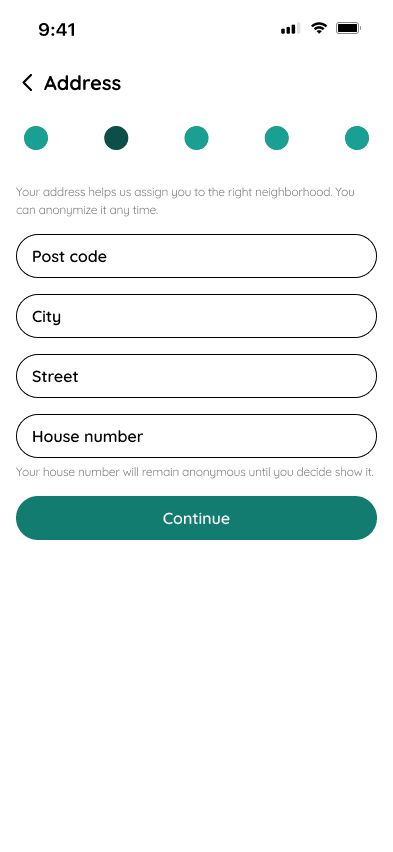
I was responsible for the verification flow throughout all fidelity stages. The lo-fi established the logic: email → address → ID document → photo upload → confirmed. Mid-fi and hi-fi followed global verification UX standards — the same patterns used by banking and identity apps.
Two internal disagreements shaped the final product. First: I proposed allowing phone number verification in addition to documents — the team voted for documents only. Second: the team wanted an intermediate "apply and wait for approval" step between a request and contact. I argued it added unnecessary friction and we wouldn't finish in time. The day before submission, we ran out of time and implemented the simpler direct-contact flow I had proposed from the start.


Kindly connects verified neighbours through a feed of nearby requests. Users create a request with category, description and photo — volunteers see it on the home screen filtered by distance and type.
Verification requires real name, address, email confirmation, SMS code, and a government-issued ID. Every user in the system has passed the same process — this is the trust foundation the app is built on.
Direct chat opens immediately after applying to a request — no waiting for approval.




The psychological barrier finding changed how we thought about the product. The app isn't primarily about logistics — it's about making vulnerability feel acceptable. That informed the warm visual tone, the name Kindly, and the decision to show real photos and names of requesters.
The verification debate was instructive: good UX arguments don't always win in a team setting, and that's fine — but the outcome validated the simpler approach. Adding phone verification would have also reduced friction for users without physical ID documents, which is a real accessibility gap worth addressing in a next iteration.
My original concept — dual-role users and minimal flow — became the foundation of the final product.